Prevenio
Brand development for food technology company that is protecting lives and the trust we have in the food we eat.
( 🥬 💦 🔬 )
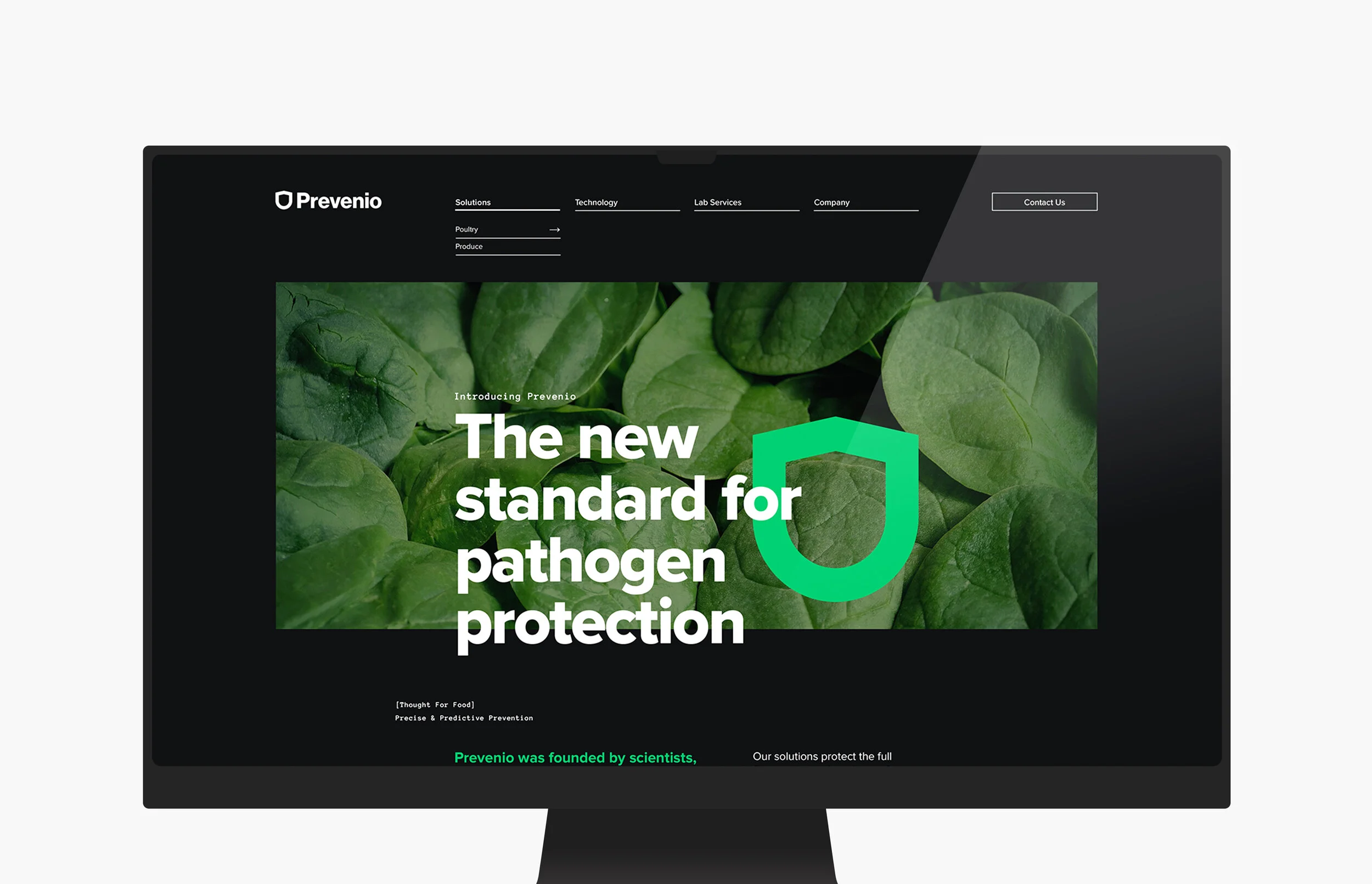
A fresh start
The name― A play on the word prevention using latin “venio” for arrive or approach. We’re getting right to the benefit of the solutions and applications.
The symbol― The Fresh Shield represents protection from foodborne illness and extended shelf life for products. Prevenio not only protects our food, but their solutions prevent wasteful water overuse and keep workers safe by removing harmful chemicals.
The color― Our hue of green, lovingly dubbed Verde Fresh, was chosen to represent a neutral reading on the pH scale and to immediately imply natural foods and freshness.


The product line
We developed a secondary color palette and logos to unify the brand offerings and visually identify all of Prevenio’s solutions. We adapted a filled version of the Fresh Shield and placed it to the top-right of each wordmark to represent the exponential value the solutions provide.


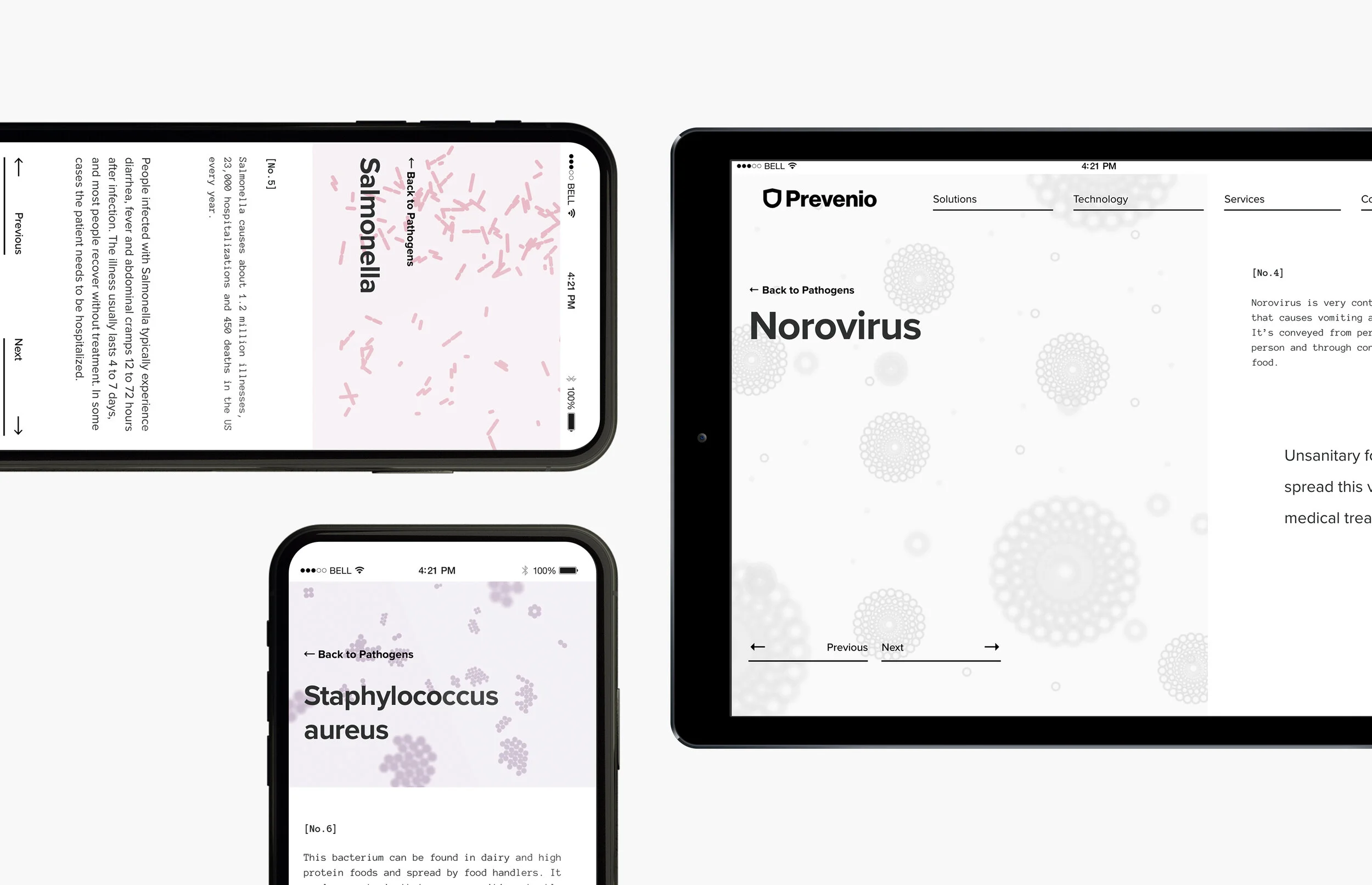
Information delivery
The responsive website was designed with clarity in mind—to deliver complex scientific information with simplicity. A quote of Einstein’s was our guidepost when developing the approachable brand messaging. It seemed appropriate.
“If you can't explain it to a six year old, you don't understand it yourself.”