Portsmith
Visual ID and collateral for The Fifty/50 Restaurant Group’s high-end seafood concept in the Eurostars Hotel.
( 🐠🍴🍷 )
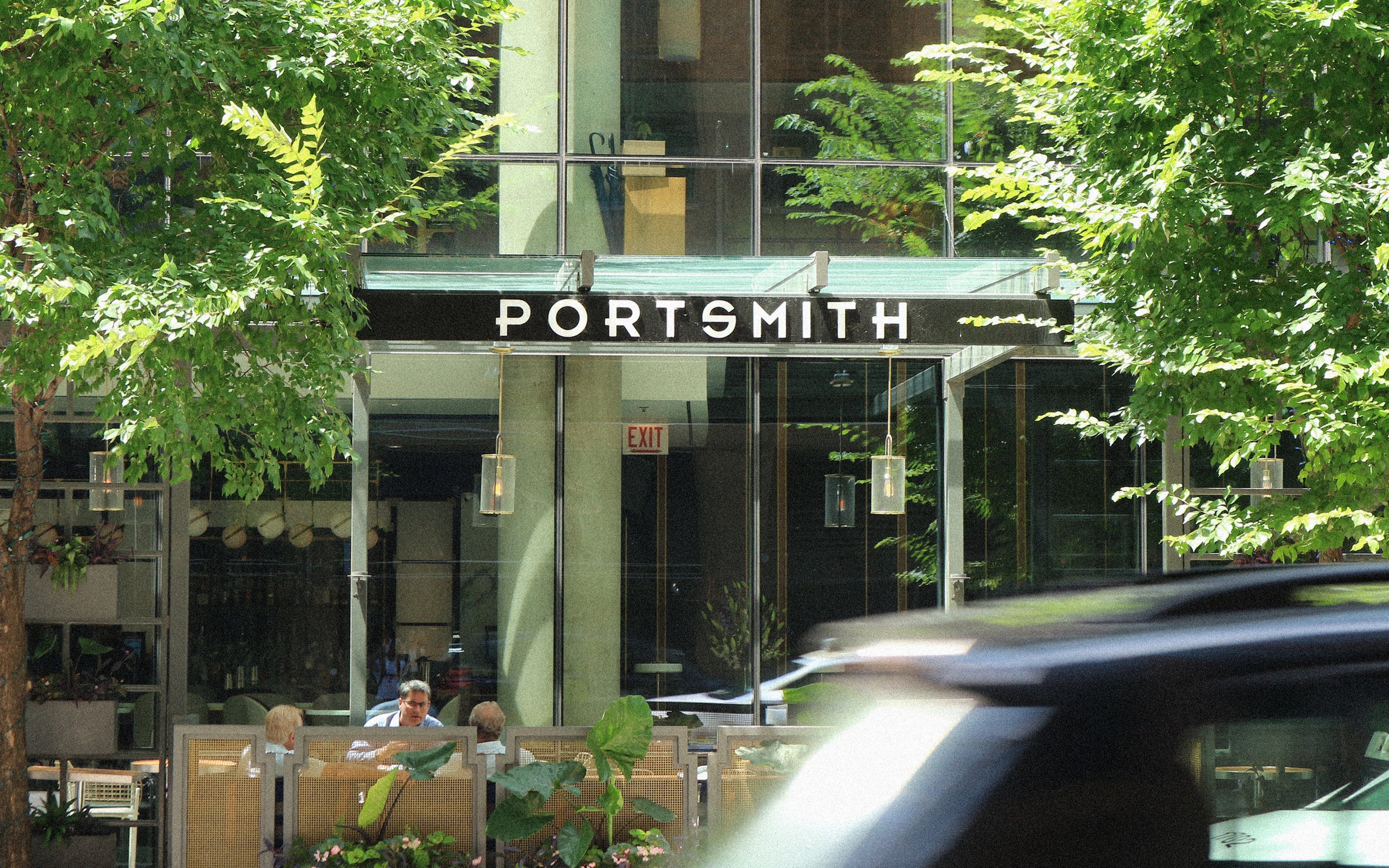

Photo credit: Blochaus

Portsmouth, New Hampshire with a Chicago accent
The symbol―the lattice fish―takes inspiration from the interior design elements. The wordmark was developed to reflect the art deco atmosphere of the space. Together they blend metropolitan and seacoast style to unify interior and graphic designs.


Fishing lines and the vibrant sea
The refined, hairline pattern represents fishing lines―calling to mind the seafood fare.
To evoke the sea, we chose that blue to give the identity a contemporary and elevated feel and to accent the heavy use of wood and marble in the restaurant.


Photo credit: Blochaus

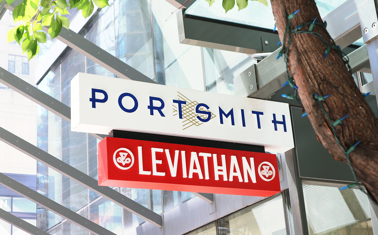

Photo credit: Blochaus
